Introduction
The core feature of this User Manager AppJar is user management. It provides the typical CRUD operations to create, view, update, and delete users in the application.
Users listing
When you open the view, the application displays a listing of all available users in the system. You can apply filters to manage large user lists.
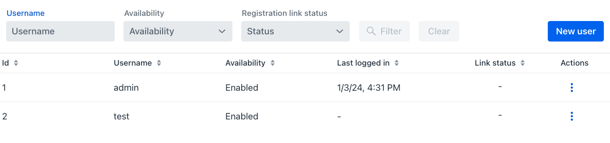
The view has two areas: The upper area holds the filter components and the New user button, and the lower area has the user grid.
Filters
This view displays fields for filtering users by Username, Availability, and Registration Link Status. To learn more, see user grid.
Once you enter content in any of the filter components, Filter and Clear buttons become available.
Filter actions
- Clear: Click this button to remove all criteria from the filter fields and restore the user grid to its default state.
-
Filter: Click this button to apply the current filter criteria. The application filters the grid contents using the supplied information, as follows:
- Username: Enter text to view usernames that contain the entered string (case-insensitive).
- Availability: This dropdown has the values Enabled and Disabled, which you use to filter users by their current status.
- Registration link status: This dropdown lists the statuses "-" , Active, Success, and Expired, which you use to display users whose registration link status matches your selection.
Tips
- If you enter
liamin the Username filter, you see users with usernames liam, williams and william. - If you select Enabled in the Availability filter, you see enabled users, but if you select Disabled, you see disabled users instead.
- If you select Success in the Registration link status filter, you see only users whose registration link status is success. This filtering logic applies to all available status options.
Users creation
The New user button appears in the upper area, on the right side of the filter components. Click this button to open the user creation view, which supports creating new users in the system.
Username
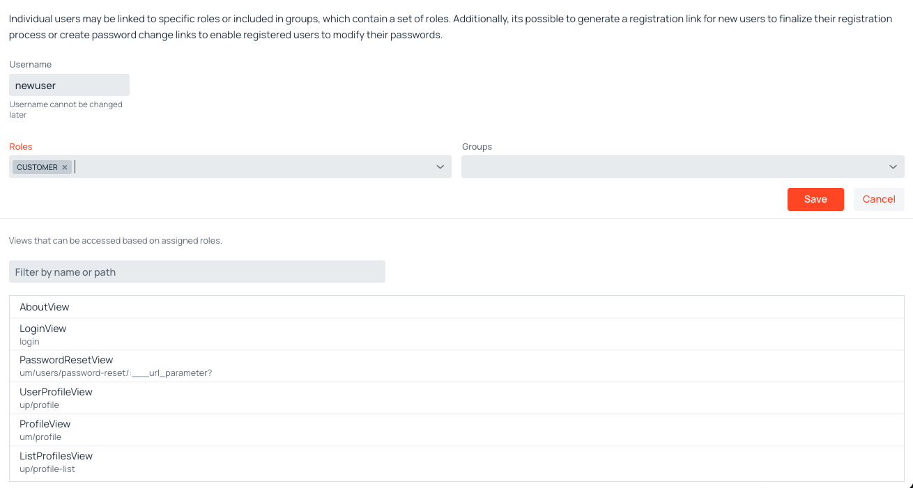
This required field represents the user's name in the system and identifies the user for credential entry. You enter the username when creating a new user, and you can't change it later.
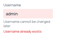
The username must be unique. The User Manager AppJar validates that the username isn't already taken before saving.
Warning
If the username is already in use, the save operation fails the validation, and the system displays an error message.
Roles
This section manages the roles you assign to the new user. To learn more, see roles management.
Roles are selected through the Roles multi-select combo box. Click the field to open the dropdown of available roles and select one or more; each selected role appears as a chip inside the field. Type in the field to filter the available roles. To remove a role, clear its entry in the dropdown or click the × on its chip.
Groups
This section manages the groups assigned to this user. To learn more, see groups management.
Groups are selected through the Groups multi-select combo box, which works the same way as the Roles selector: open the dropdown, pick one or more groups, and remove any by clearing its entry or clicking the × on its chip.
Summary
This read-only section displays a summary of the application views that the user can access based on their assigned roles and groups. The list updates automatically as you change the user's configuration.
Action buttons
The form provides the following action buttons:
-
Save: The Save button persists the changes you make in the form. The system executes required validations before saving and displays any errors so you can fix problems before trying the save operation again. To learn more, see username.
-
Cancel: The Cancel button discards the changes and returns you to the users listing view.
Losing your own access
When you edit your own user account and the roles and groups you leave assigned would no longer grant you access to the access rules editor, a warning appears on Save and asks you to confirm before the changes are persisted. This prevents an administrator from removing their own ability to manage access rules without noticing.
The check considers the roles inherited from groups as well as those assigned directly, and it evaluates them against the access rules currently in force, so the warning appears only when access is actually lost. Cancelling it returns you to the form with your changes intact.
Users grid
In the lower area, the users grid displays the users in the system. By default, the grid shows all available users. After applying search criteria, the grid displays only the filtered users. This grid shows the following columns:
- Id: Displays the unique numerical identifier for the user. The system assigns this value automatically in sequential order.
- Username: Displays the user's name assigned during creation. To learn more, see username.
- Availability: Indicates the user's state, which controls their access to the system. To learn more, see the enable/disable user.
- Last logged in: Shows the date and time the user last entered the system.
-
Link status: Shows the status of the associated registration link, which can be:
- —: Indicates the link's unsent state.
- Active: Indicates successful sending of the link, but unverified usage by the user.
- Success: Indicates the user successfully used the link to register.
- Expired: Indicates the link has expired unused.
-
Actions: Displays a dropdown menu that shows actions you can execute on the user in the current row. To learn more, see the action menu.
Action menu
User actions display in two locations on the users grid:
-
Actions column menu: The standard dropdown menu appears when you click the three dots in the actions column.
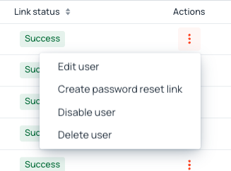
Action Button Dropdown Menu -
Row detail panel: Clicking anywhere on a user's row expands an inline detail panel below it. This is a separate interaction from the ⋮ dropdown and provides the same set of actions in a more visual layout.
The panel is divided into two areas:
- Assigned authorities (left): Displays the user's roles as badges. Roles inherited from a group appear as
RoleName (GroupName); roles assigned directly to the user appear by name alone. - Action buttons (right): Four buttons — Edit, Link, Enable/Disable, and Delete — corresponding to the same actions available in the ⋮ column menu. See Edit user, Create link, Enable/Disable user, and Delete user for details on each action.
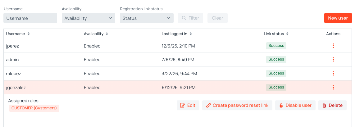
Row detail panel: authority badges on the left, action buttons on the right On mobile screens, the panel also displays the user's Availability and Last logged in values above the authority badges, compensating for the columns hidden on small screens.
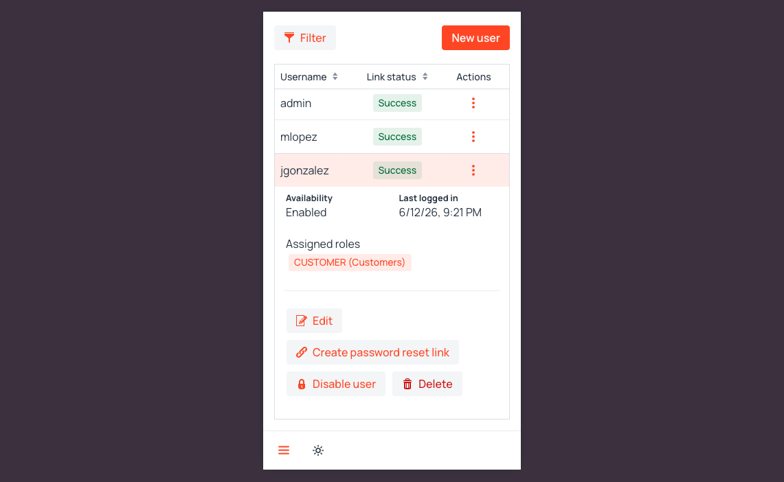
Row detail panel on mobile — includes Availability and Last logged in fields - Assigned authorities (left): Displays the user's roles as badges. Roles inherited from a group appear as
Edit user
This action displays the user's edit view, which is similar to the user creation view. The view includes the same Username, Roles, Groups, and Summary sections.
The main differences are the following:
- The username field remains locked after creation and doesn't support modifications. To learn more, see username.
- The Create password reset link button appears next to the username field. To learn more, see the create link.
- The Delete button appears in the action buttons section. To learn more, see the delete user.
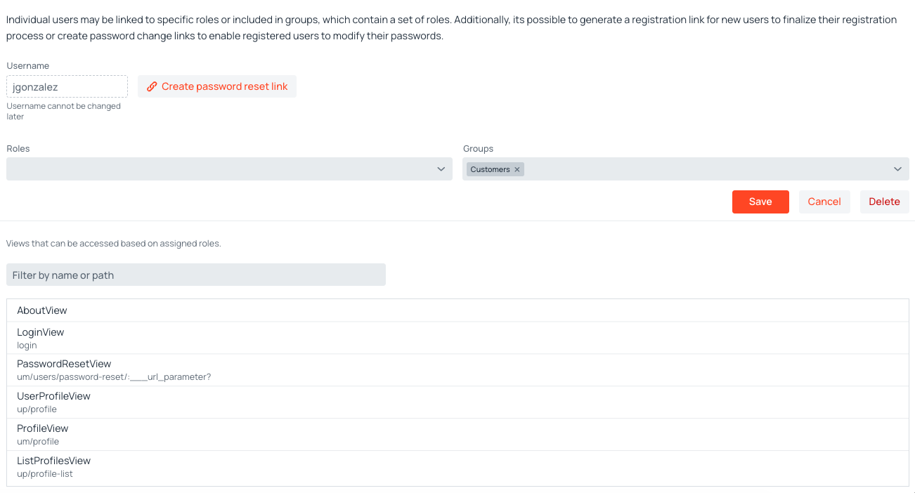
Create link
This action displays the password set/reset dialog, which generates a unique, time-sensitive registration link. The link's purpose supports two different user scenarios, reflected in the action's label:
-
New user registration: The action displays as Create registration link for users who haven't completed registration so, haven't set their initial password.

Create Registration Link -
Existing user reset: The action displays as Create password reset link for current users who need to reset their password.
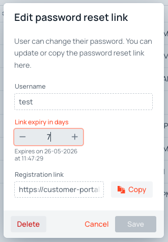
Create Password Reset Link
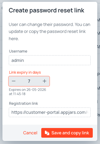
When you click this action, regardless of its label, the password set/reset dialog appears. The dialog shows the user's Username and provides you to set the link's expiry in days, which defaults to 7. Below this part, a text displays the estimated date and time when the link expires. The generated registration link appears in a read-only text field. Finally, the dialog presents two action buttons:
- Cancel, which stops the creation process.
- Save and copy link, which persists the link and copies it to the clipboard so you can share it with the user.
Completing registration with an external provider
When at least one external authentication provider is enabled (see Authentication Providers), the registration link view shows a row of provider buttons in addition to the password fields. The invited user has two ways of completing the registration:
- Set a password: The user types and confirms a new password and clicks Sign Up. The username and password become valid credentials for the regular login form. The user remains free to also sign in through any enabled external provider whose identity matches the username.
- Sign in with an external provider: The user clicks one of the provider buttons (for example, Sign in with Google). After completing the OAuth flow, the user is signed in immediately and the registration link is marked as completed. No password is stored, so regular sign-in is unavailable until an administrator issues a password reset link.
The external account used to complete the registration must match the pre-provisioned username. If the user signs in with a different account (for example, a Google email that does not match the username), the registration link is not consumed and remains active for the intended invitee. The OAuth identity is then treated as a standard external login and is accepted or refused based on the Allow new signups flag of the corresponding provider.
When regular authentication has been disabled at the provider level, the registration link view hides the password fields entirely and shows only the external-provider buttons.
Enable/Disable user
This action controls the user's state, which determines their access to the system. An Enabled state grants access, while a Disabled state denies entry. The action's label reflects the user's opposite state:
- If the user is Enabled, the action displays as Disable user.
- If the user is Disabled, the action displays as Enable user.
When you click this option, the system changes the user's state.
Delete user
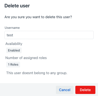
This action displays a confirmation dialog before executing a permanent deletion of the user from the database. The dialog shows the user's details, including the username, current availability, number of assigned roles, and the number of groups that the user belongs to. You confirm the deletion process by clicking the Delete button in the dialog.